CASA JAZMIN ;
Co-Director — 2020-2021
Brand Identity, Social Media, Campaign Strategy, Copywriting, Art Direction & Photography, Video, Packaging, E-commerce Solution
CONTEXT: Casa Jazmin emerged as a museum/space for studying the ways of living that were established in 1800s upper La Peña; a neighbourhood of Blanca (Murcia) which guards the rise to a 12th century Mozarabic castle. It's one of the last ancient plots - a coral house spread over 2 layers with poultry yards, terraces, and a sprawling jasmine tree.
The owners of Casa Jazmin (AADK, an arts organisation) used the space to exhibit work by their residential artists - whilst preserving its morphology and distribution in an attempt to gain an ethnographic vision of the past - it acts as a vessel for reflection and gives it’s visiting inhabitants an enchanting environment for kinetic craft.
Footage Credit : Abraham Hurtado
I was contracted by AADK to transition Casa Jazmin into an online point of sale. This developed into an array of different projects from business strategy, all the way through branding, content & communication, to launch as an e-commerce marketplace for local, residential and passing artists.
CONTENTS: (01) BRAND IDENTITY (02) PRINT & PACKAGING (03) SOCIAL MEDIA
(01) BRAND IDENTITY
BRIEF: Create a brand identity for Casa Jazmin, scaling in size but also corporate-creative aesthetic, as the brand must adhere to both funding associations and artistic providers/consumers. An identity that reflects the history of the physical space, and the traditions in local craft. It needs to communicate the heritage, but in a modern tone, with stylistic similarities to the umbrella brand of AADK.
SOLUTION: A base logomark (above, left) comprising of 6 lanes in irregular stroke, reflecting the 6 categories of crafts sold (Artwork, Reproductions, Ceramic, Produce, Music, Publications) whilst the composition itself refers to the jasmine flower. The surrounding shape (above, right) is based upon a polarisation of AADK’s bracketed logo, and becomes part of Casa Jazmin’s brand assets; a series of ‘nets’ that act as the container for brand imagery, with the form’s orientation and elongation being a mode for differing displays and creative depth.
Monotype and full-texture variations, dependent on use-case. The colours are that of the earth and volcanic rock behind Casa Jazmin, the texture is esparto - the traditional local craft of weaving dried grass into rugs/homeware. The logotype is Averia Libre, a rounded serif with analogue character within inconsistent stroke and terminals to pair well with the logomark.
Screenprinted T-Shirt
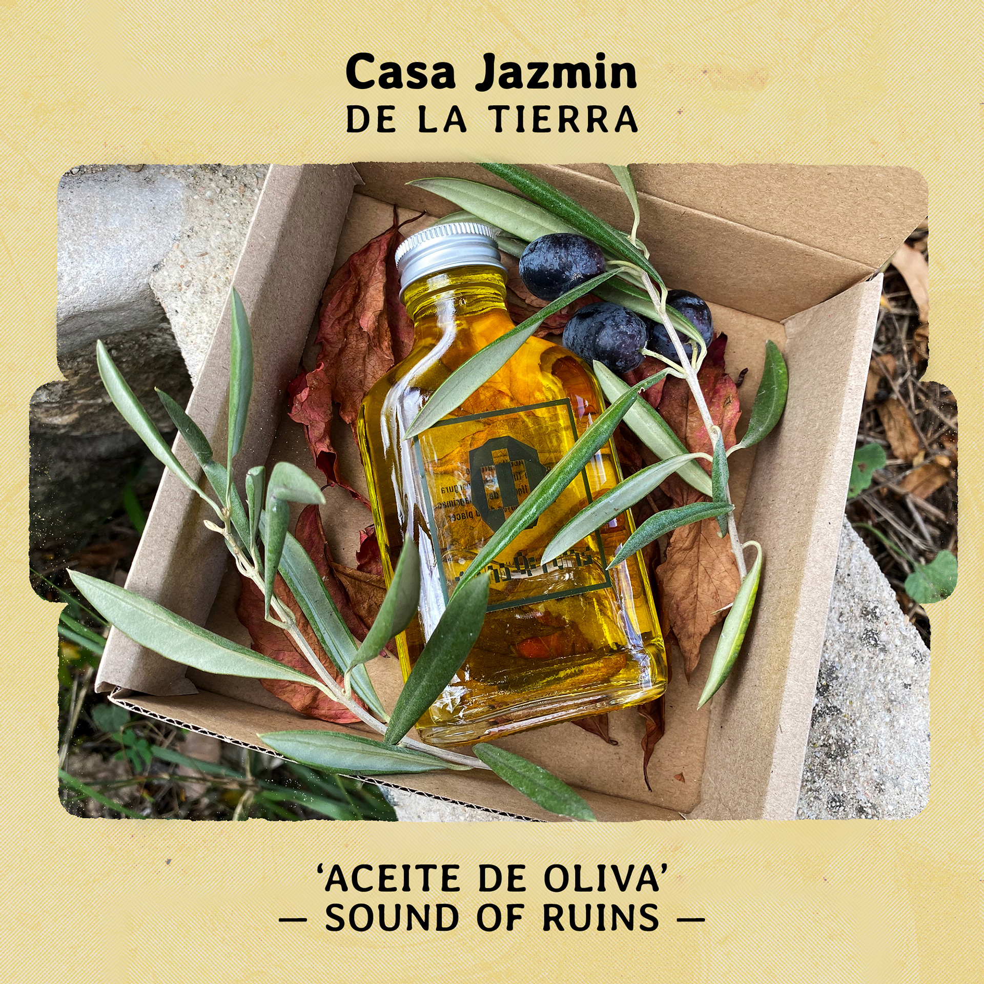
Product Marketing
(02) PRINT & PACKAGING
Screenprinted carton packaging, with branded sticker as the seal
Handout marketing booklet (front)
Handout marketing booklet (back)
Event Invitation
PoS Tag
Screenprinted carton bag with rope handle
(03) SOCIAL MEDIA
BRIEF: In-line with brand identity & strategy create templates for the 7 phases of marketing. Show Casa Jazmin's context through the content, whilst building momentum and clarity towards the first collection of products to be released. Create banners for Facebook & Etsy, profile pictures, and provide brand guidelines detailing formatting for posts & stories. Copywriting in English & Spanish.
SOLUTION: Working with fellow co-directors and with consultation from supplying & consuming artists we generated a plan for launch. This detailed the steps necessary within the time allocated. I visited several times to document the space of Casa Jazmin and then continued to work remotely, with social media & e-commerce accounts activated and a content scheduler (Business Suite) in place.
Phase 1 : Context
Using the photographs I digitally collaged various compositions depicting the spaces throughout the plot. These large format pieces were spread across 6 posts on Instagram during Phase 1 market strategy, as we began to launch Casa Jazmin and build the following. The content progresses through the physical space, and to the following eye the graphical elements of brackets become more visible until they're forefront, a fathering reference to AADK.
Phases 2 & 3 were about releasing the brand identity in its various displays / creative depth, and how it engaged with the patina of Casa Jazmin through the content, texture & colours.
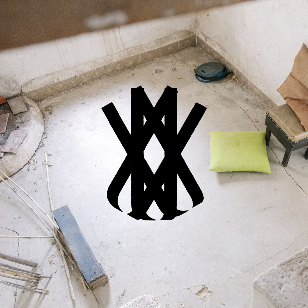
Phase 2 : Brand Launch
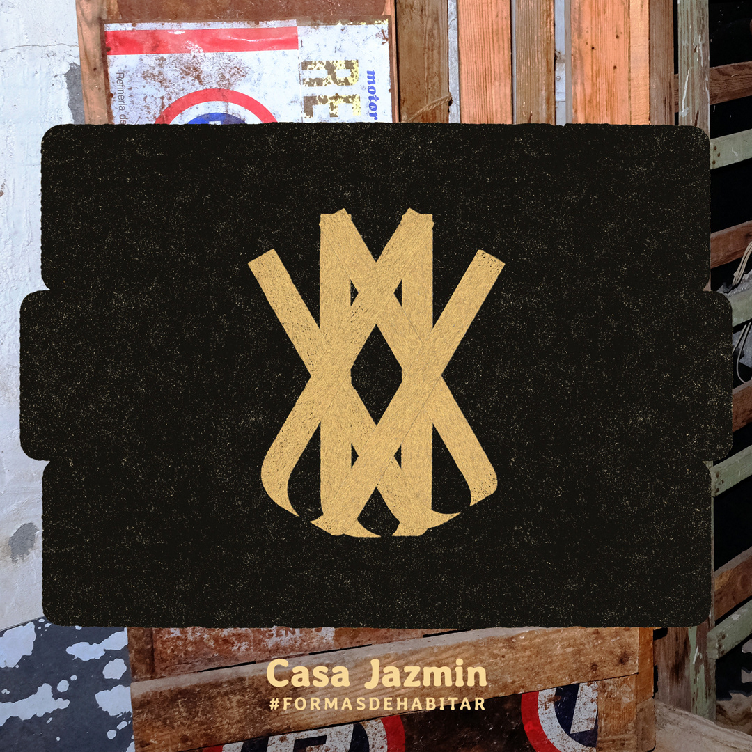
Phase 2 : Brand Displays
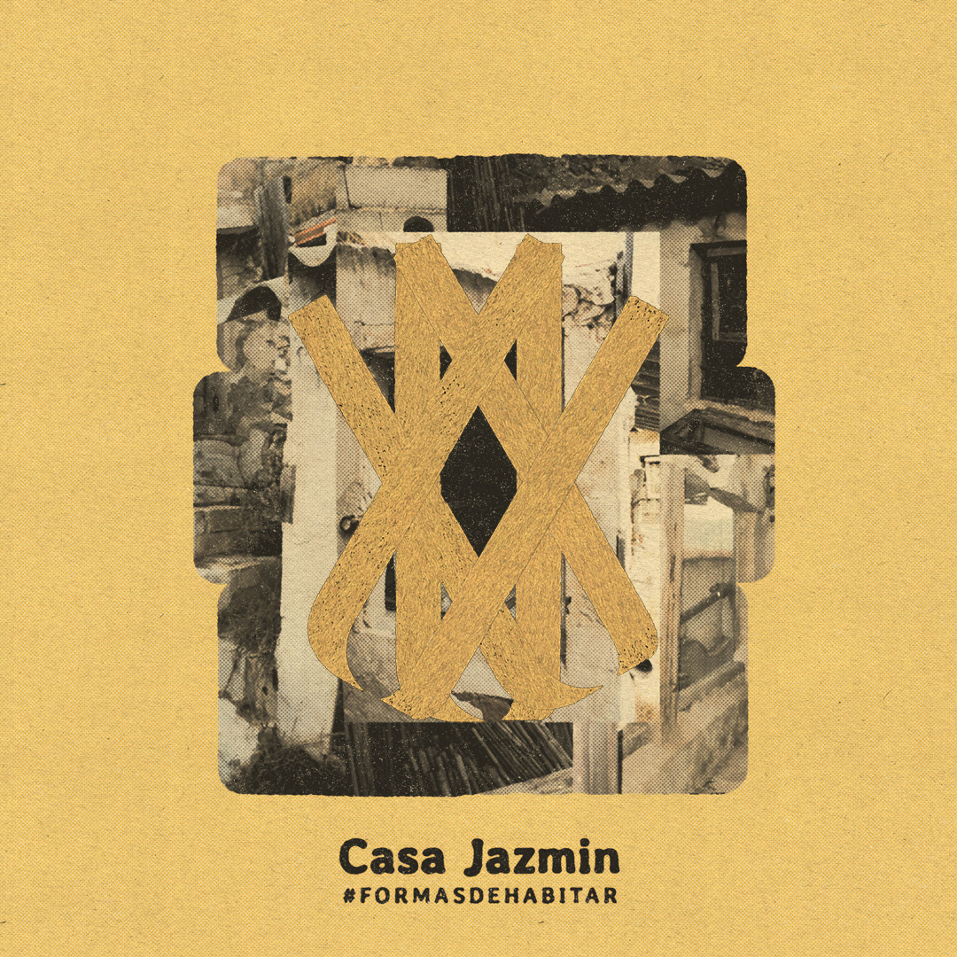
Phase 3 : Brand & Content
Phase 4 : Vision (English & Spanish versions)
Phase 4 was to show the space in video format, placed within the elongated brand container / net. Within the video content we introduced the business concept through a scripted dialogue (English & Spanish versions).
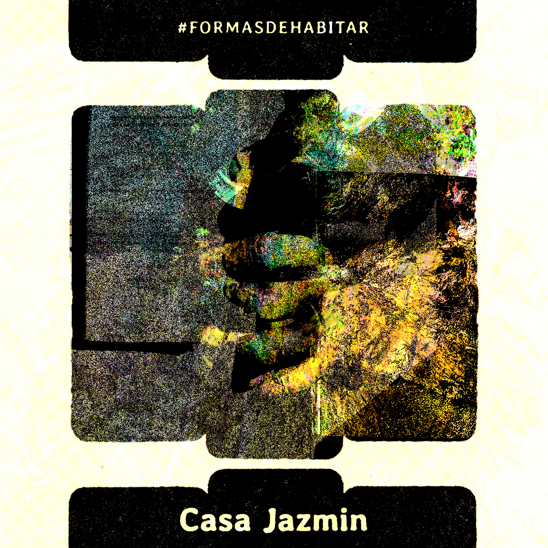
Phase 5 : Release Teaser
Phase 6 : Artist Release
Phase 6 : Artist Release
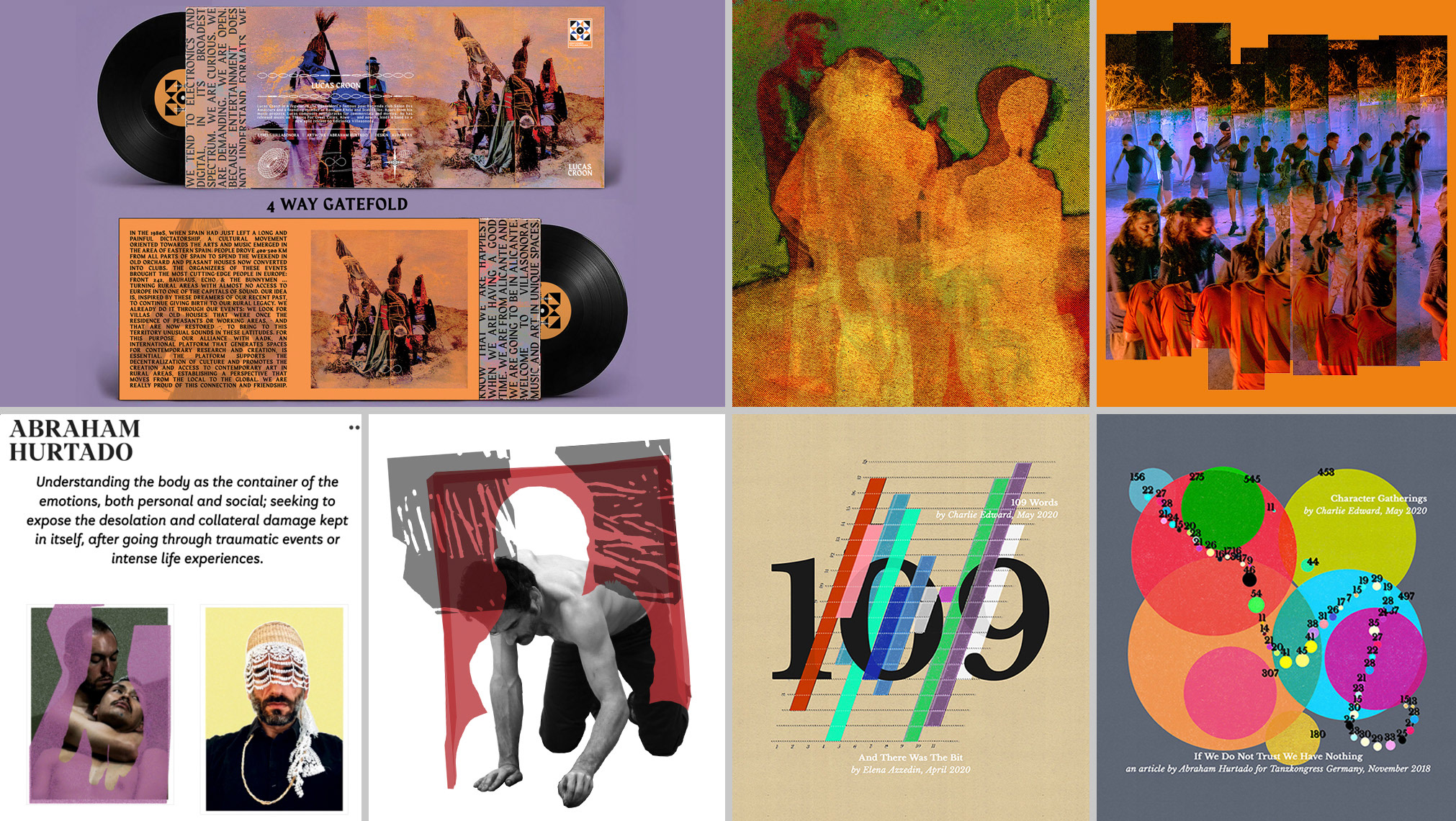
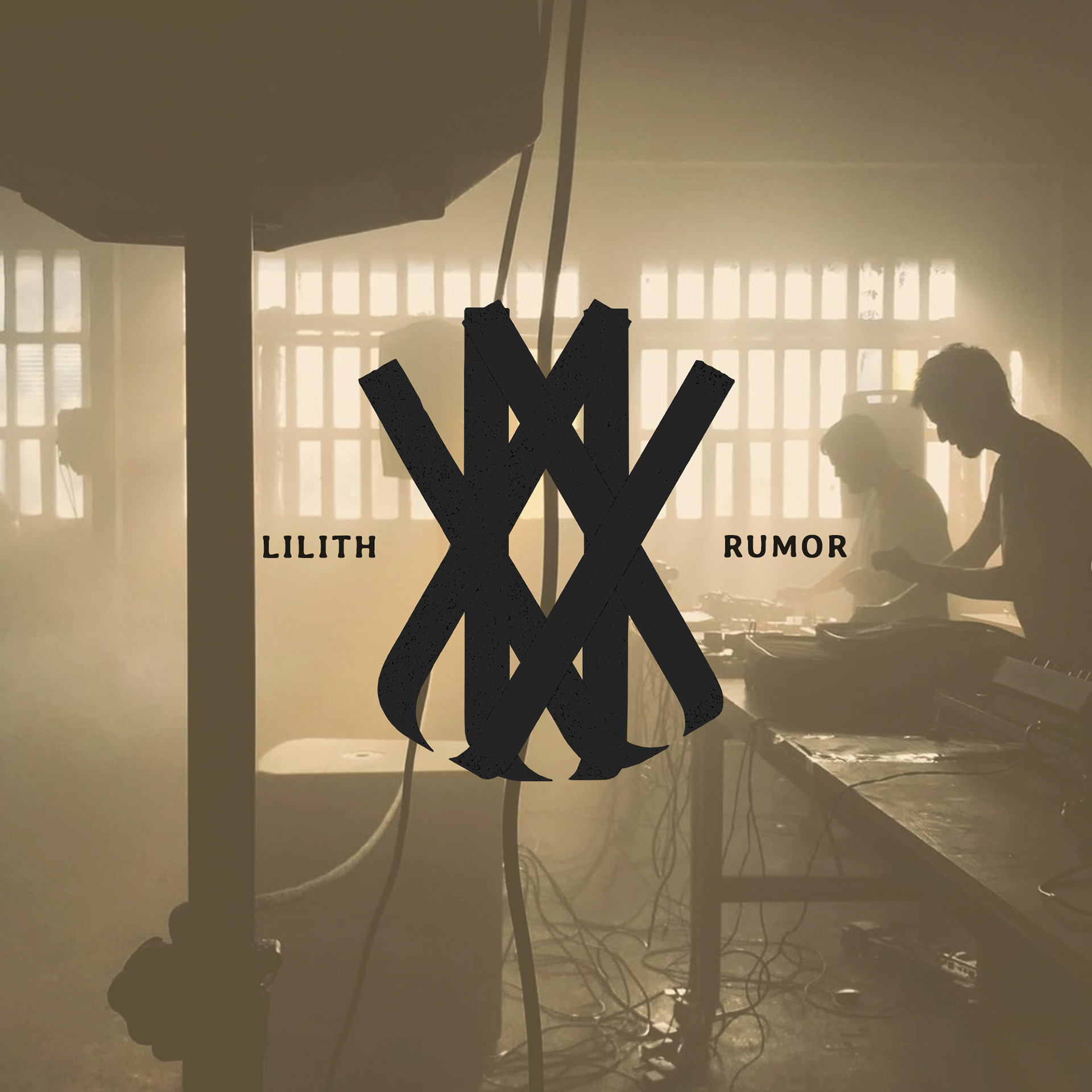
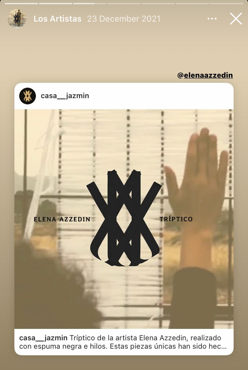
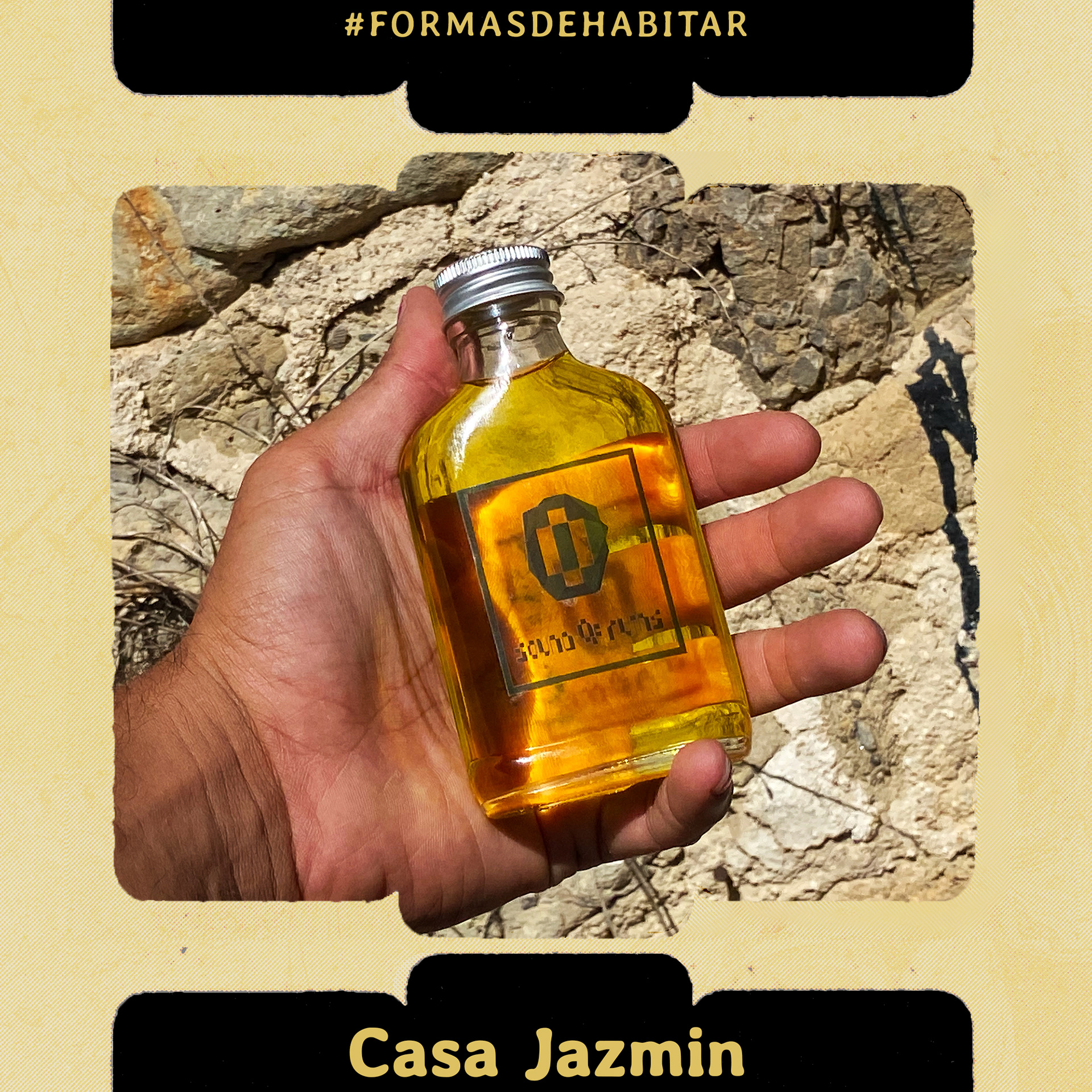
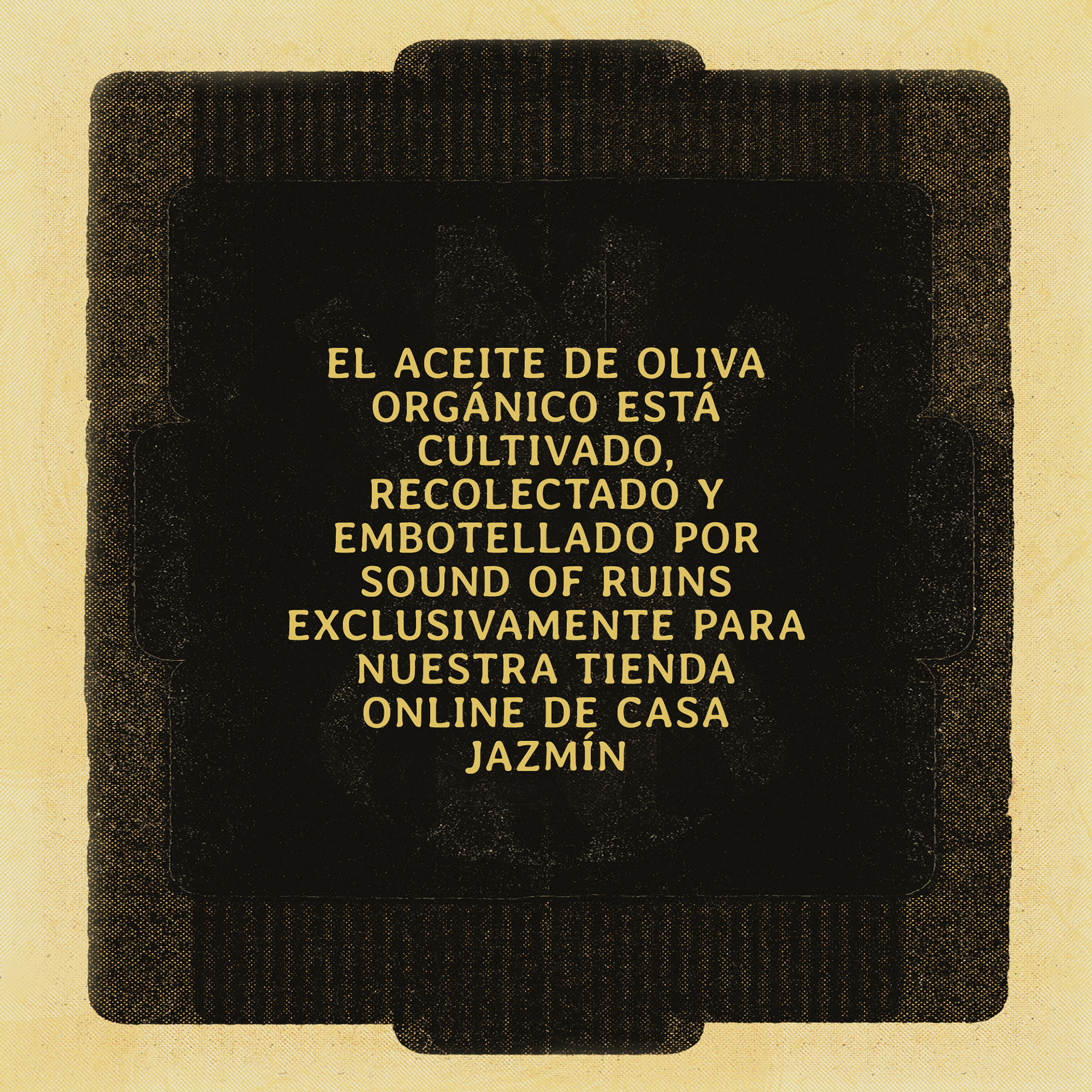
Phases 5, a string of teaser images showed the product template, with its central imagery an amalgamation generated by layering catalogued images of the products. The upper and lower 'tabs' join to form a + net form, connecting the products when stacked on the Instagram grid (see below). Phase 6 (above) introduced the artists included within the 1st collection, along with their product title & category.
Phase 7 : Collection Release
Product Slider - Page 1
Product Slider - Page 2
